Project Description

In a world of shapes and signs, every brand seeks the right to occupy a specific territory.
Brands are more than products; they sell experiences that connect with the emotion and desire of the user. Therefore, reaching the heart of the consumer requires creating the clearest evocative visions that support uniqueness and builds coherent messages.
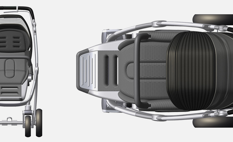
Our work for Newell Rubbermaid’s Teutonia brand in Germany was driven by the aim of simplifying the number of design elements and provide a coherent global design language that can be consistently applied to all the aspects of the brands product manifestations. The result of the program was an extensive toolkit and vocabulary of forms, shapes, surfaces, details and graphic brand applications clearly expressing the identified brand values.
The new approach required deep analysis of the design languages, trends and cultural meanings. The design language toolkit helps a brand to create barriers for the competitors that are seeking new consumers. Our design strategy provided a concise palette of forms and meanings to guide all Teutonia vendors and govern future product development reinforcing their customer’s belief in the product and
loyalty to the brand.
Services & deliverables:
– Primary (ethnography) and secondary research
– Competitive brand analysis in Germany and Sweden
– Brand and market positioning
– Brand DNA analysis and definition
– Visual design language system and architecture
– Form and shape vocabulary
– Industrial design
– Product branding applications
– Toolkit for organizational and vendor guidance